
Visual Editor for WordPress
Visual Editor for WordPress
Is a visual editor the best fit for your WordPress website?
Introduction – Visual Editor for WordPress
WordPress is the best CMS for most website projects but that doesn’t mean it’s always the easiest for client’s to use. WordPress’s interface changes regularly and though the latest version has a built in visual block editor, it is still a ways off from being the all-in-one editing and design tool for websites.
A great option is to include a visual editor with your WordPress install – Divi, Elementor, and BeaverBuilder are great choices for visual editors that have evolved into great solutions over the years. I”m going to focus on Divi in this article.
Getting Started With A Visual Editor
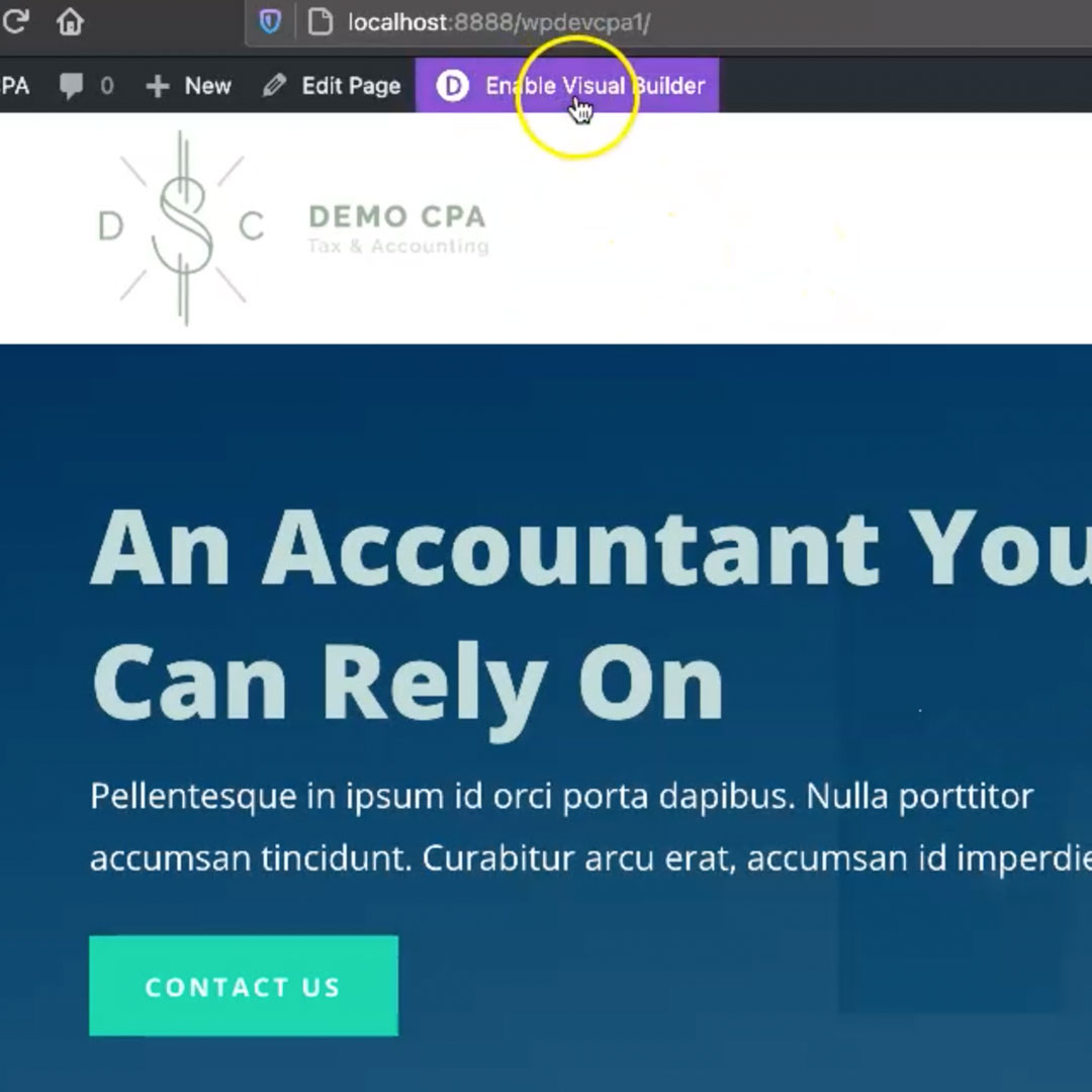
Once Divi is installed and configured, it’s really easy to use. Simply log into your website and then navigate from the default dashboard to a front-end page like your home page. Once there, you will see a button at the top that says “Enable Visual Builder”. Click that button to start the process and it launches the page into “editing” mode.
Editing Sections and Areas
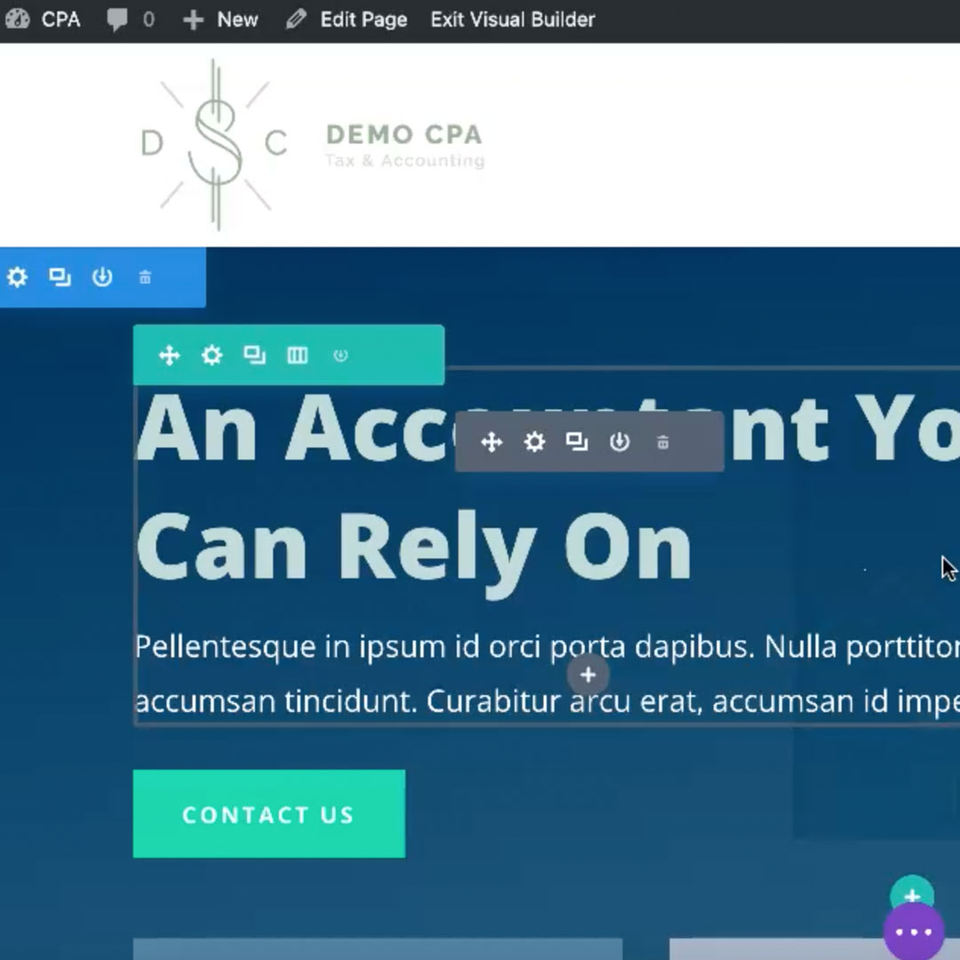
Once you’re in visual editing mode, mouse over areas of your website. You’ll notice various colored borders appearing around different parts of the page. Divi breaks down these components into:
- Sections (blue) – a main part of the page defines an area.
- Rows (green) – component nested within a Section that is made up of one or more columns.
- Modules (grey) – The component within the one or more columns of a row that have images, text, video, etc.
These sections of the site have various features that are similar to each other (ability to edit the background and move that component around). They also have unique features that are only available to that component (such as the ability to add and edit text).
Widgets and WYSIWYG
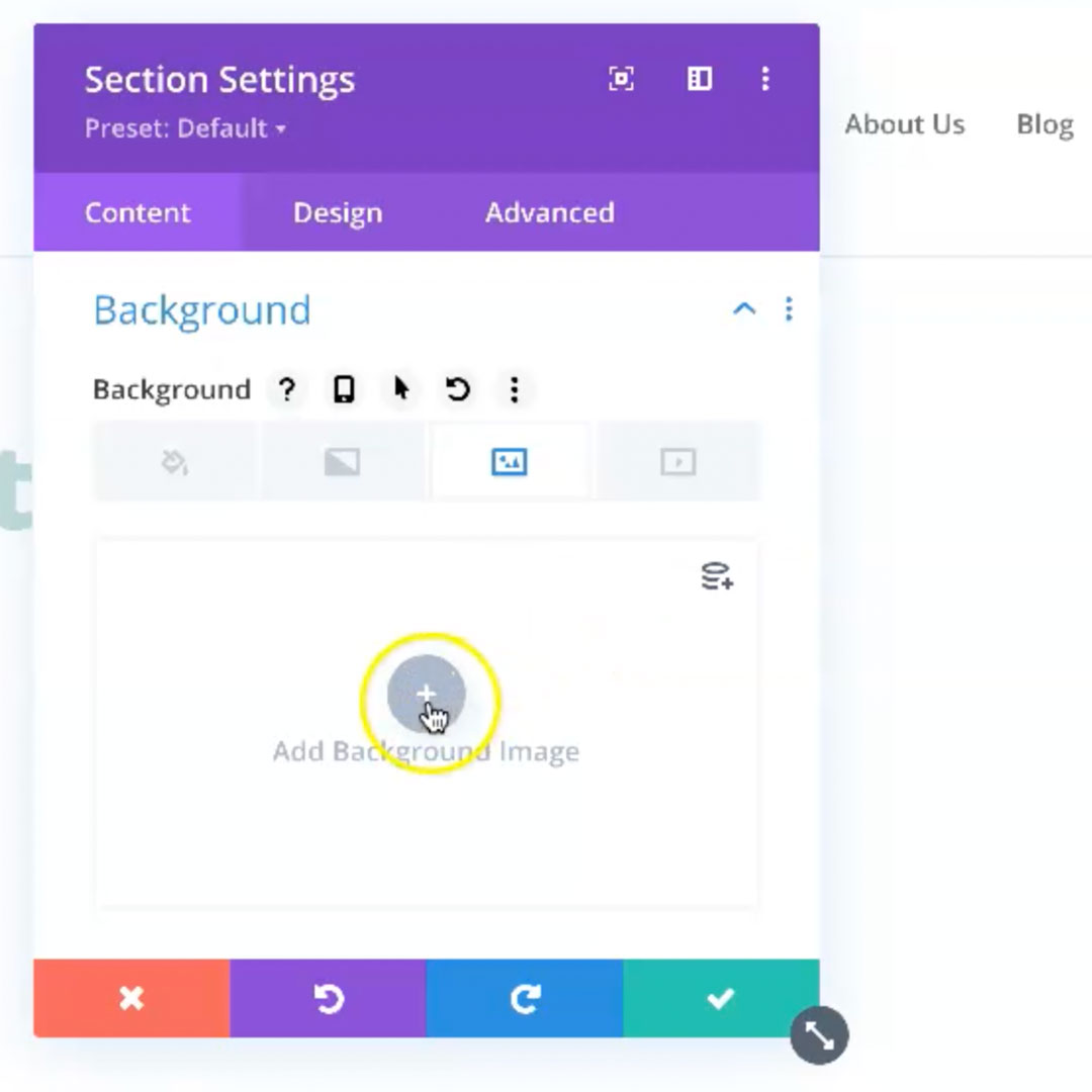
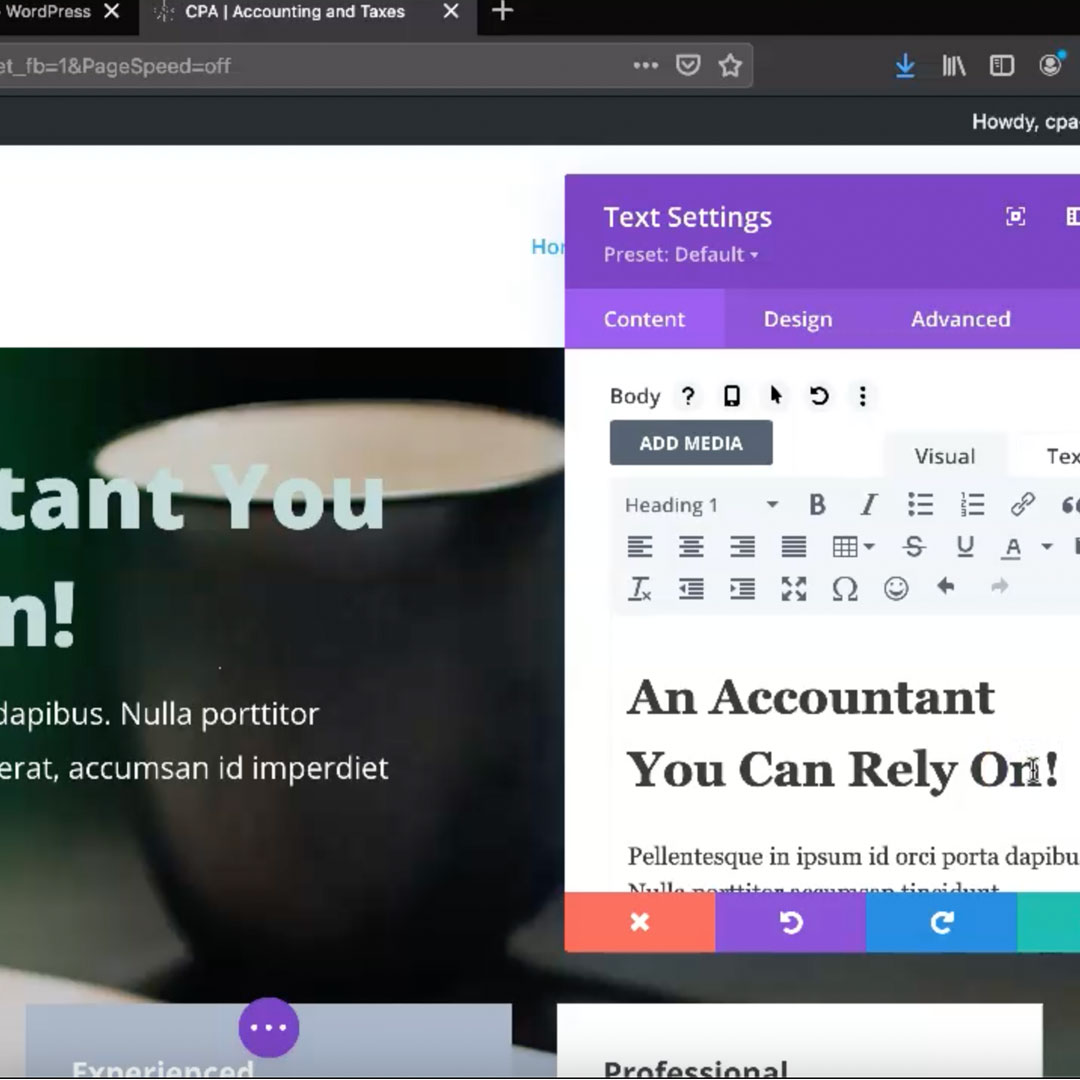
When you click on the gear icon it opens up the WYSIWYG editor that allows you to make changes inherent with that particular component.
The WYSIWYG (what you see is what you get) editor has many options built in including the ability to change:
- Font – font updates including the entire library of Google Fonts.
- Size – text size and line spacing is easy to adjust.
- Color – you can choose from a default set or you can use the built in color picker.
- Shadow – add shadows to shapes or text.
- Spacing – alter the margin and padding between components.
- Animation – add and edit animation for various components.
- Links – add and style links.
- And more.
With a little practice you can accomplish most customizations using the visual editor.
Changes Appear On Screen
Unlike the default way that WordPress worked before they introduced their own block editor, when you use a visual editor to make changes the updates appear on the screen as you make them. It is easy to see how a background image, text color, or additional component will affect the design because it renders onto the screen as you make it. If you don’t like the change, simply click the red X to discard. If you like the new update, click the green check button to save that change.
You can even make adjustments and changes to target various screen and device sizes. This is helpful if you are customizing an area of your page and are not sure how it will look on mobile devices. Once you apply the mobile view to the page you can even edit that particular section to target just the mobile screen size. This is extremely helpful when fine tuning a website.
Customization
You can customize many of the options available with the visual editor. Starting with the default configurations, you can:
- Update the color palette to your custom brand colors.
- Designate default font and text-size.
- Update global defaults – you can alter the global defaults that will affect the whole site with a few clicks of a button.
Streamlining Edits
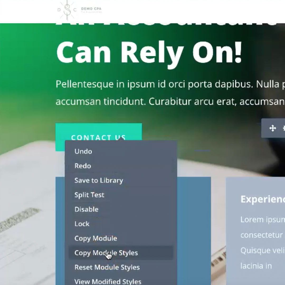
With both the use of the global defaults and the ability to copy and paste styles from one component to the next, you can streamline your website edits.
You have the ability to quickly clone sections, rows, and components to repeat them on the page. With that feature, you can build the perfect section once and then duplicate it and switch out the text and images. You can also save sections and components to the theme library to easily access them in the future. You can even create a new page by cloning an existing page, allowing you to quickly build a page by cloning and then editing that new page.
There are Many Widgets/Components to Choose From
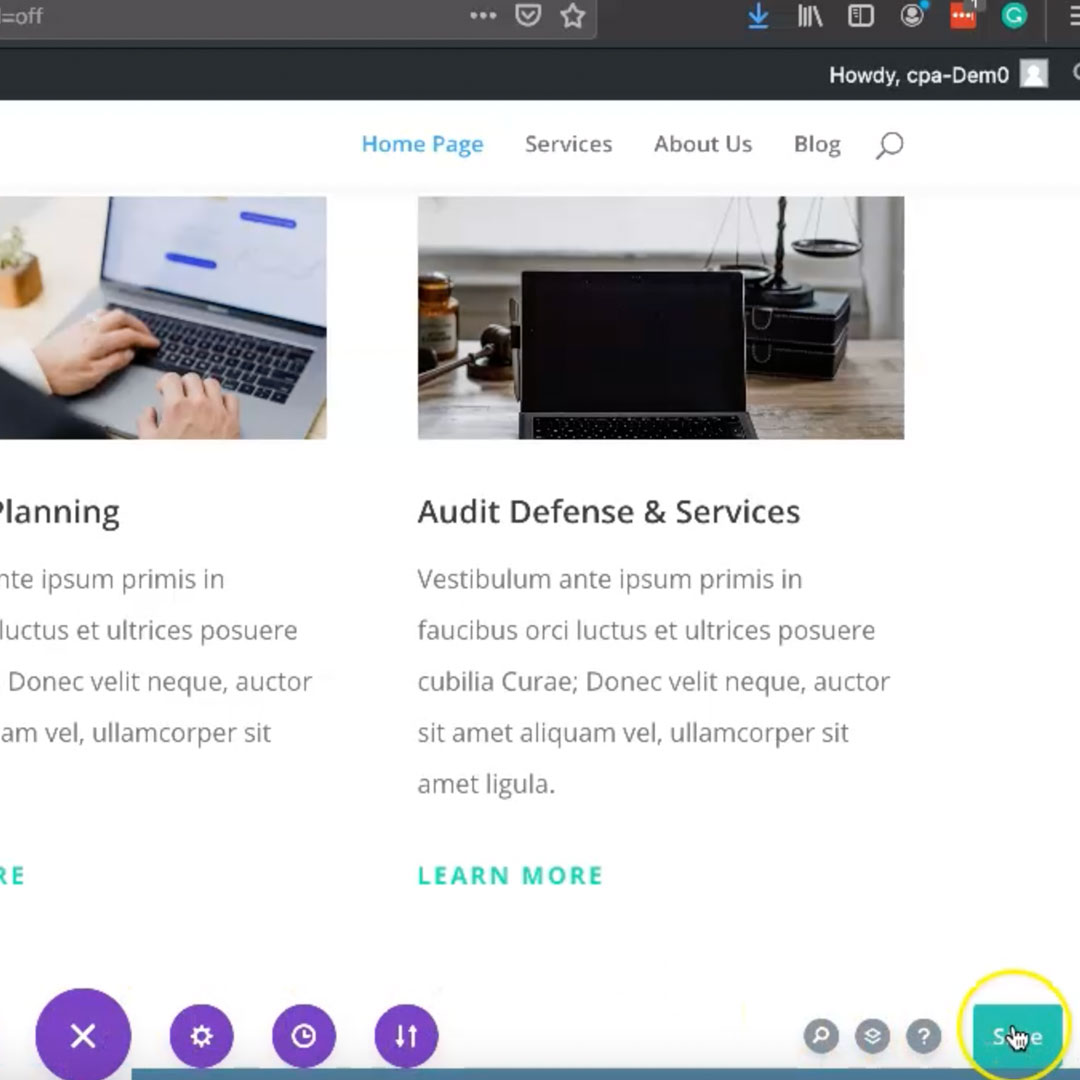
There are many types of components to choose from. When you create a row and add a component, you can add
- Image – an image that will scale to fit the area you add it to.
- Text – a robust text editor with the ability to designate color, font, size, animation and more.
- Video – URL link to a YouTube, Vimeo or self-hosted video.
- Blog – a post-type blog feed based on category or other criteria.
- Code – custom code box for adding short-codes or other higher level implementations.
- Form – a web form such as a contact form.
- Map – Google map
menu – sub menus based on the criteria of your choice - Etc – And many more. There’s a growing list of available components.
Conclusion
WordPress is a powerful CMS that can be enhanced for client usage by a visual editor such as Divi, Elementor, and BeaverBuilder. Visual editors still require design and configuration that can be complex depending on the design and scope of the project, but the extra work put in will allow for clients to edit the website in a more visual way, similar to products they may already be using such as Microsoft Word, Apple Pages, SquareSpace and other visual interfaces.
If you are interested in learning more about how Egor Media can design and develop a custom website for your business, or if you are interested in retrofitting a current site with a visual editor, contact us to learn more.
